Wednesday, 30 March 2011
Monday, 28 March 2011
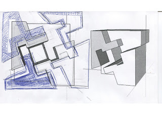
Datium - Re looked at. 343KB 300DPI
I disliked the crowded and spikiness of my first idea for Datum and so re looked at more effective shapes as I liked the idea of one or two coloured images with black and white images in the background. My favourite design out of these is the bottom right as it still portrays datum but consists of three planes which flow in an continuous movement opposed to the theme of the other design where 8/16 of the original components are repeated around a single point in a particular basic order.
Friday, 25 March 2011
Screen Shot - Symmetry 545KB, 300DPI
Of these three images I prefer the top image as if shows the depth of this design and disappears to a singular point. I also like the idea of the white transparency with the black background because of the contrast compared to the transparency on the white background.
Screen Shot - Proportion 192KB 300DPI
I dislike the xray view as the composition has too many lines in it making this style less effective. Of the views I most prefer the middle image although think this could be improved.
Screen shot - Repitition 490KB 30DPI
In this image I dislike the lowest image as the combination of the fog and xray style lose the shape of the image and make it hazy and hard to identify. Of the two upper images I experimented with how colour would effect the design and found that I disliked the use of a bright colour. I liked the view of the top image looking down on the design, a close up could work well aswell.
Screen Shot -Figure ground 290KB, 300DPI
In these scree shots I like either of the lower two although could get further into the image. I the harsh sharp edges which are used in the lowest model although I also dislike the opacity used in the upper two models.
Wednesday, 23 March 2011
Screen Shot Contrast 321KB 300DPI
With this image I prefer the lower screen shot as it gets inside the image and had more interest. However I like the x-ray element of the above design. The contrast between white and blue also helps to enhance the theme of contrast within the composition. Look into various colours.
Screen shot - Heirachy 230KB 300DPI
With these screen shots I prefer the camera position of the third as you get submerged within the composition opposed to viewing it from a distance with negative space surrounding. I also like the layering effect that is created although a better angle could be found which does not have the negative space on the left side. I like the idea of the opacity being lowered on the boxes although also like the solid form, possibly a way to do both to provide emphasis on certain boxes.
Screen Shot - Datum 519KB 300DPI

Of these two images I prefer the lower image this is because the flow is better from a central point outwards getting smaller opposed to the thick bulky appearance the upper image gives. I find that both these images are very cluttered and the shape of the component could be simplified and made more interesting.
Symmetry 202KB, 300DPI ; 28KB 300DPI


Here I first looked at making a symmetrical pattern and repeating this although when I made it in solid works it was a boring and simple image with no interest. I then had a second look at the design and came up with a more effective way to portray Asymmetry through using cylinders opposed to spheres and extruding and cuting away at them.
Patterns - Contrast, 487KB 300DPI and Symmetry, 410KB 300DPI
My new patterns for the design principles of Contrast and Symmetry after I edited my original concept.
Symmetry 2D 354KB 300DPI
I disliked my symmetry pattern and so did a few 2D sketches until I came up with a concept I was happy with.
Contrast 3D 332KB, 300DPI
For this sketch of contrast I revisited my original 2D image and looked at ways in which I could change this in order to make it more interesting.
Tuesday, 22 March 2011
Repition 300DPI,241KB
My first pattern sizes ranged from 1.8-2.0MB and so I am now posting them at a lower size as have taken the minimal section of the pattern opposed to a larger image.
Tuesday, 8 March 2011
Sunday, 6 March 2011
First Images - Symmetry/Asymmetry 270KB 300DPI
First Images - Repetition and Rhythm 336KB 300DPI
For Rhythm and repetition I chose to continue with the bottom right hand sketch as the pattern in simple yet effective wheres I personally did not particually like any of my first three sketches
Subscribe to:
Comments (Atom)


